BentoBox News
The BentoBox UI Redesign
April 9, 2019
Designing for hospitality—a look into the redesign of our backend user interface
This morning we proudly launched our redesigned backend user interface. The new UI will support our continued commitment to developing new products and features for the hospitality industry. We want to share with you some of the big changes you’ll notice and how it will empower restaurants online more than ever before.
The Need For a Redesign
From a design perspective, it was time to reimagine our backend interface. We gathered feedback to discover existing pain points while using our platform with the goal of improving the experience. From an engineering perspective, we sought to bolster our code structure, futureproofing our platform. Making these changes meant that our user interface could be both pleasing to the eye, run smoother and run faster—laying a solid foundation for a more robust BentoBox.
Main Areas of Focus
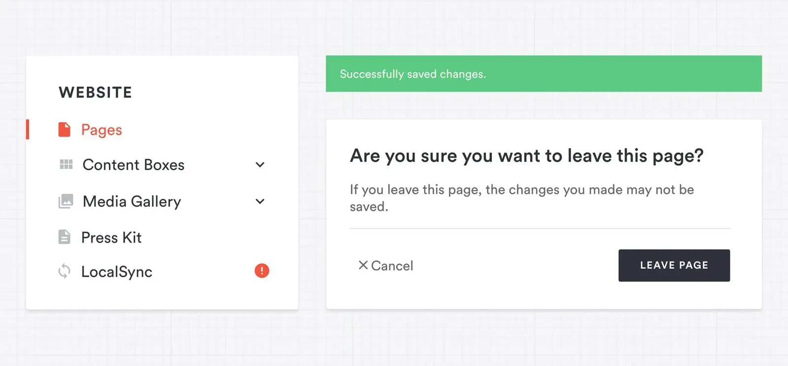
The new UI prompts the user to save changes before leaving the page.
Visual Design
For visual appeal, it was necessary to brighten up the backend by replacing the dark grey background to white and with colors aligned with our recent rebranding. This allows for easier communication and visual cues while being consistent with our image. A more pleasing design often has a hidden effect of making a tool’s usability enjoyable. In addition, more useful content to reflect how restaurants navigate our backend was placed on each page without sacrificing simplicity. This increases productivity throughout every step so that updating your website is quicker and more efficient than ever before.
The Mobile Experience
While our backend interface has always been considered mobile-friendly, we noticed room for improvement so that the mobile experience was on par with that of the desktops. We recognize that restaurant operators are constantly moving and rarely on the computer. You’ll find that updating your food and drink menus and managing your website from a phone or tablet, to be more intuitive than before, as improving this aspect of our platform was crucial in our rethinking.
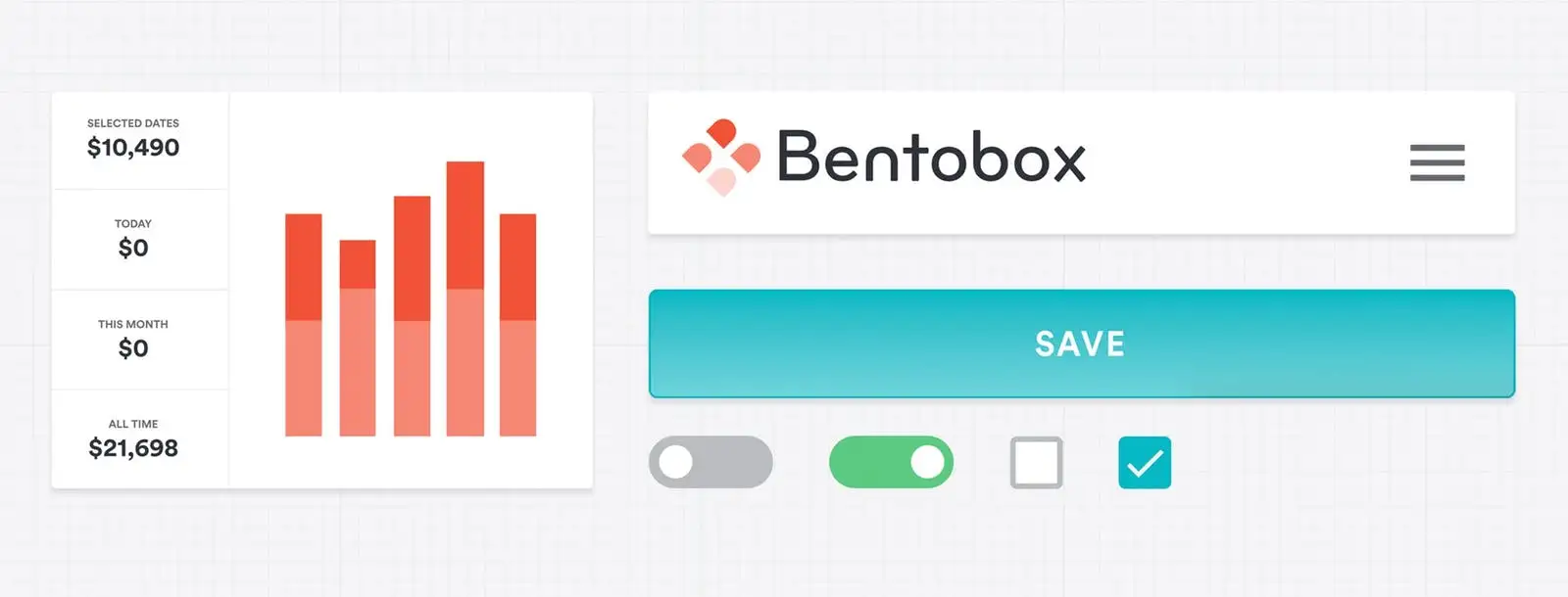
The new UI is more mobile-friendly than the previous version, with greater visual cues and buttons.
Establishing Familiar Functions
A problem that can arise from a redesign is unfamiliar functions. It was important for us to make these changes while keeping basic functions the same. You’ll notice that how you operate the backend will come naturally—learning how to use one feature will be similar to all the others. Anticipating your needs and actions online is reflective of how restaurants anticipate the needs of their guests. This usability creates a familiar experience across the whole platform and empowers you to better own your website and content.
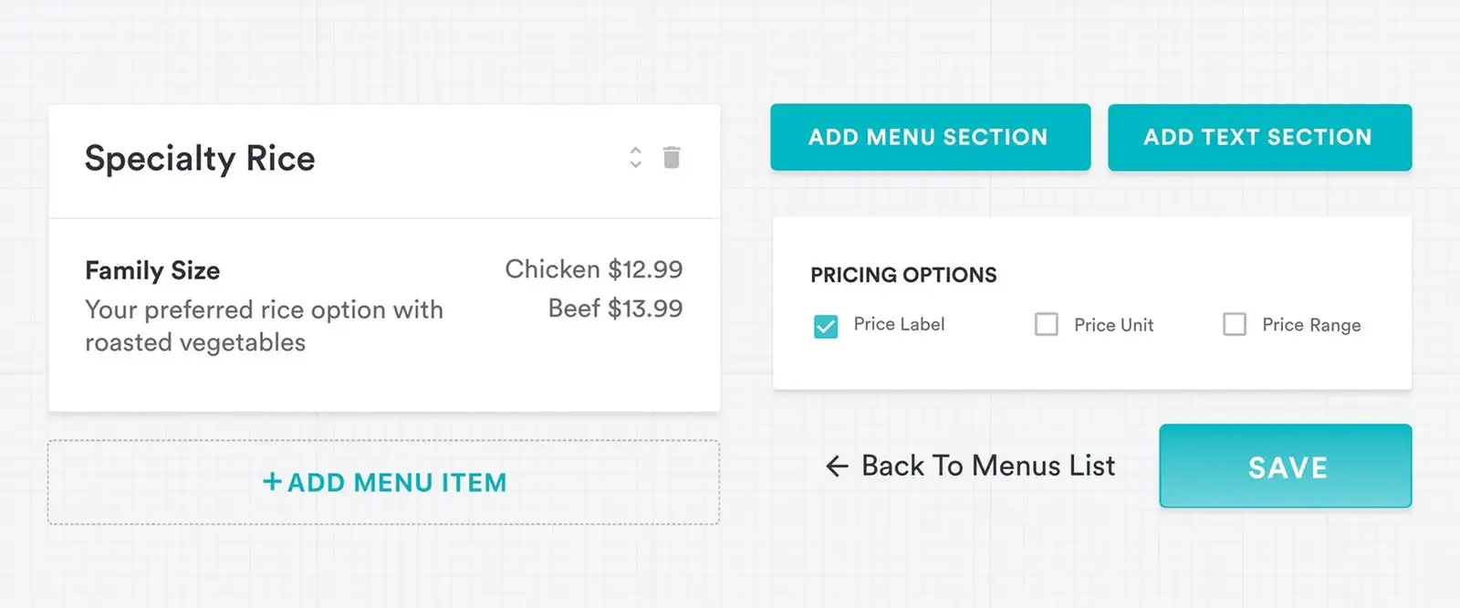
The new UI makes it more simple to update menu items.
Looking Forward
A few tweaks under the hood promotes the new BentoBox experience to work smoother and run faster by reducing load times. To future-proof our platform, we improved code quality for the development of new features and products as they come. We’re excited to continue offering new experiences for restaurants online.
In our continued commitment to making BentoBox as best as it can be, our backend user interface will be operating in beta. Feel free to get in touch and offer feedback. We’d love to hear from you!
Recommended
Design Inspiration
Restaurant Website Inspiration for 2019
January 7, 2019
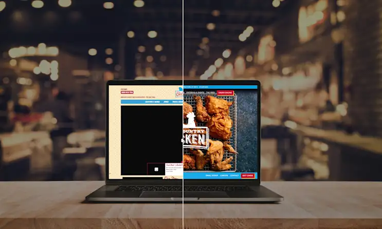
A before & after look at some of our favorite restaurant website redesigns
BentoBox News
Behind the Scenes of BentoBox’s New Branding
October 3, 2018
How and why we updated our visual identity
BentoBox News
Pre-Order & Catering: A Better Way to Capture Advance Restaurant Orders
September 7, 2021
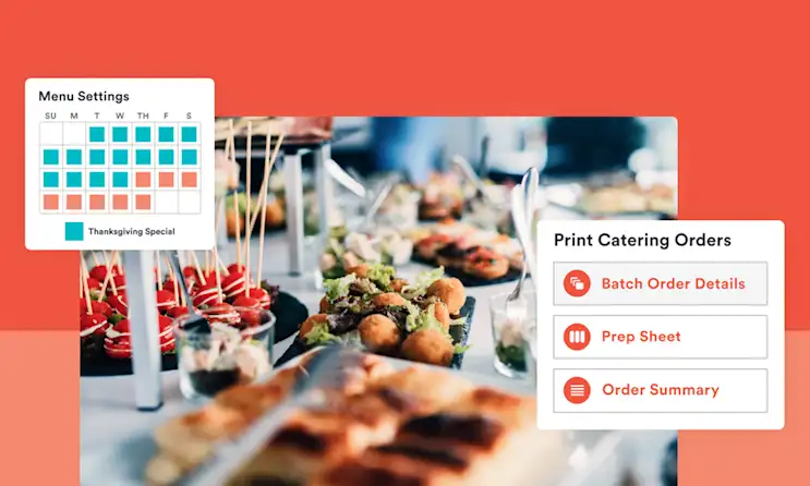
Restaurants need a more efficient way to handle pre-sell orders. Our latest update makes the process better — for everyone.
