Design Inspiration
Restaurant Website Inspiration for 2019
January 7, 2019
A before & after look at some of our favorite restaurant website redesigns
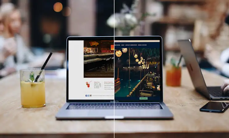
Congrats! You’ve made it through the hectic holiday season. As things around your restaurant begin to calm down, now is the perfect time to take stock of your restaurant website and make some changes. Just like last year, we’ve rounded up some of the best restaurant website transformations to give you a creative launch pad for your own website updates in 2019.
East Hampton Sandwich Co.
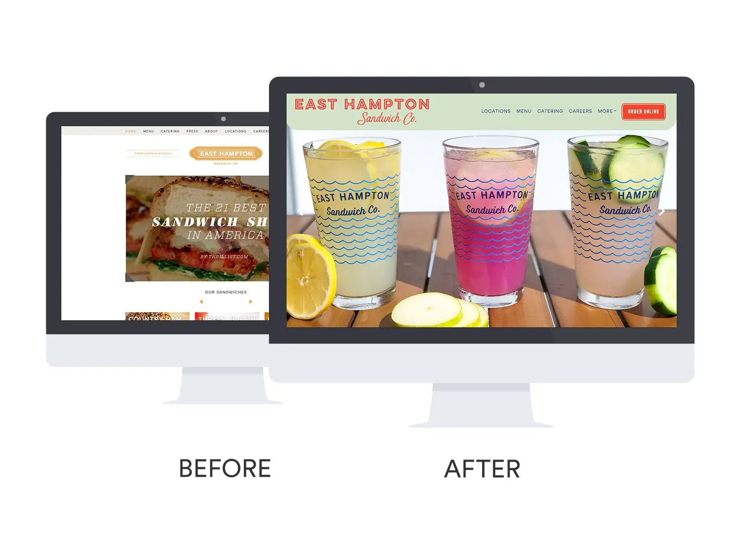
Before: The Texas-based gourmet sandwich shop was tired of the old look on their website, which felt plain next to their newly refreshed branding. They also felt they had too much content, but were unsure how to reorganize their layout in an effective way.
After: East Hampton Sandwich Co. has been able to reinvent their website. They’ve paired their bold new branding with a much simpler layout and clearer navigation, allowing guests to quickly find the information they need. They’ve also added a Careers section to their restaurant website where potential hires can apply for a position online.
The best part: Finding each of the sandwich shop’s nine locations is a breeze with a store locator built into their website. The information for each is easily accessible and clearly displayed on one interactive map.
O Ya
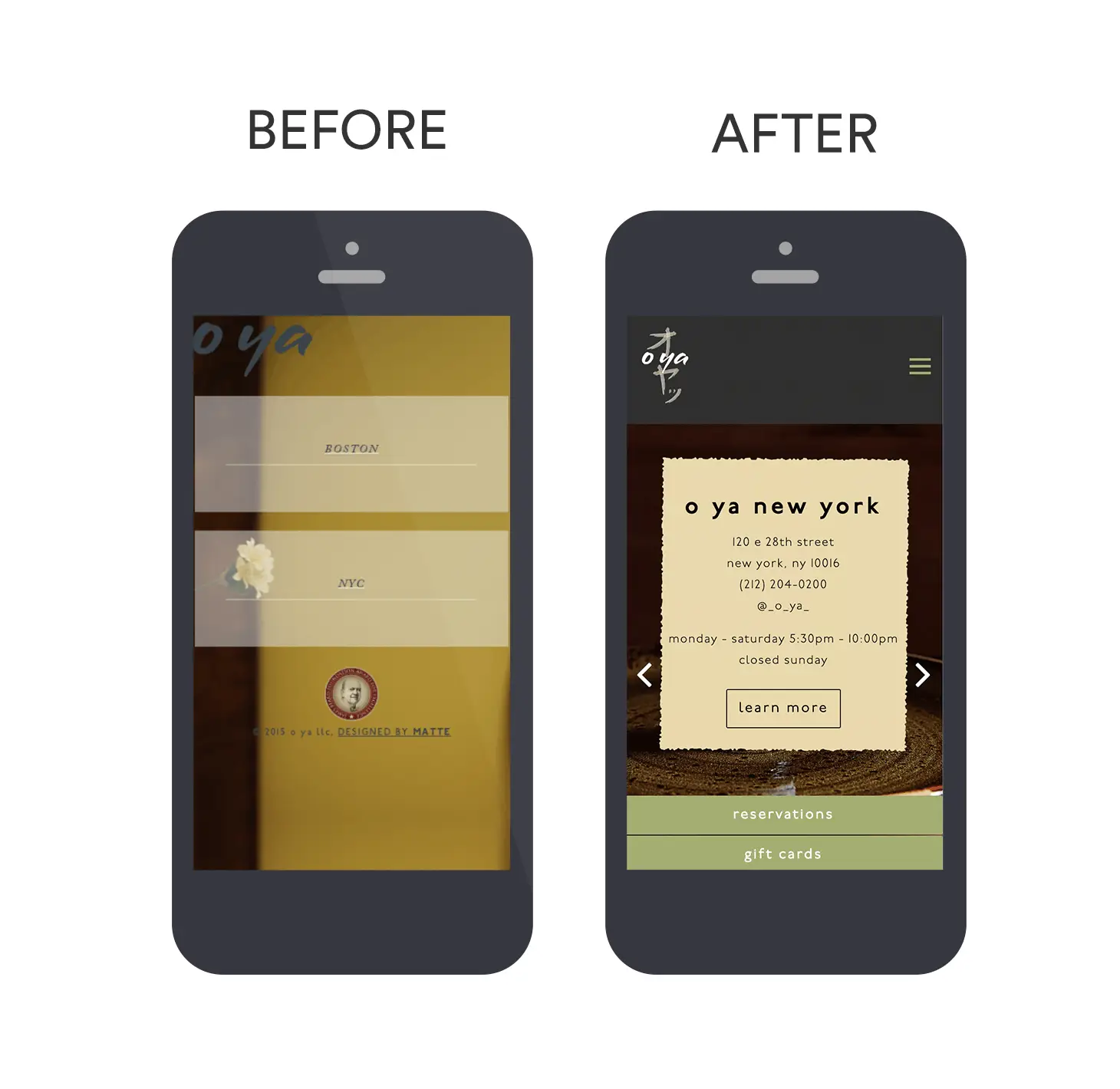
Before: The old website for this James Beard Award-nominated sushi restaurant was hard to navigate and felt disjointed. O Ya’s information was split between their two locations and it wasn’t clear where guests could make reservations.
After: O Ya’s new website unifies both locations on one website, providing easy access to all information, and allows guests to make reservations in Boston or New York with just one click.
The best part: O Ya now sells gift cards online, and highlights that revenue-driving offering prominently on their restaurant website’s homepage.
La Newyorkina
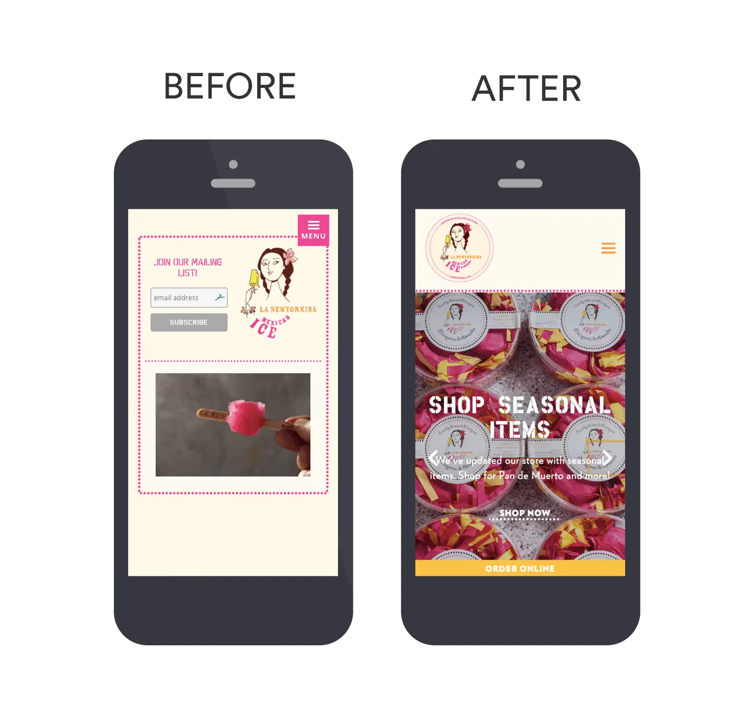
Before:eCommerce is really important for La Newyorkina, but the Mexican sweets company ’s old website hosted their online store on a third-party platform, which meant extra fees and less control. Their website was also difficult to read on mobile and only displayed an email signup on their homepage.
After: Now the company has an online store on their website, where they can easily edit and update offerings, selling directly to guests. La Newyorkina can manage their orders and website information all in one place, and offer an intuitive and vibrant mobile experience.
The best part: The business keeps things social by featuring their playful Instagram feed on their website, showing off their daily treats.
Atelier Crenn
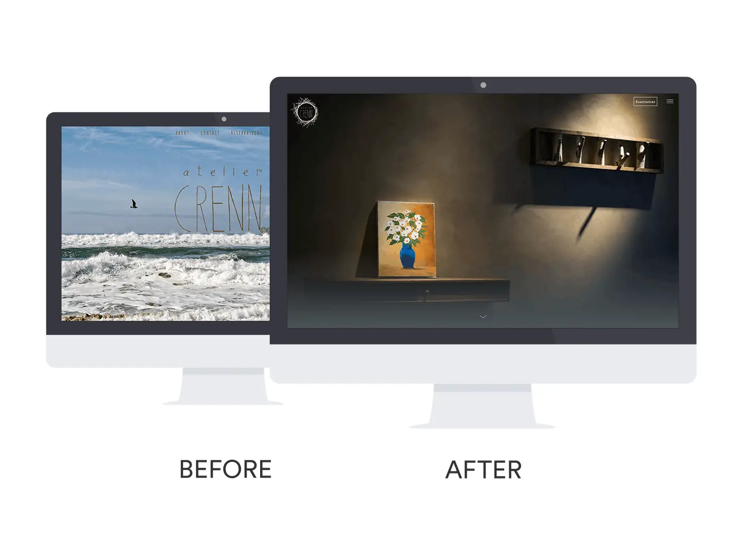
Before: While Dominique Crenn’s three Michelin-starred restaurant in San Francisco often hosts events and guests chefs, their old website didn’t have a section that highlighted these exciting dining experiences. They also had no way to promote these special events or any other important updates with their restaurant website visitors.
After: Not only does Atelier Crenn now have a dedicated page for their renowned Crenn World Chef Series, but the new website also comes equipped with homepage notifications, keeping guests up-to-date about reservations, special events, operating hours and more.
The best part: The new website better matches the restaurant’s identity, conveying the feeling and atmosphere that guests experience within the actual restaurant, as well as Atelier Crenn’s connection to its sister restaurants, Bar Crenn and Petit Crenn.
Rich Table
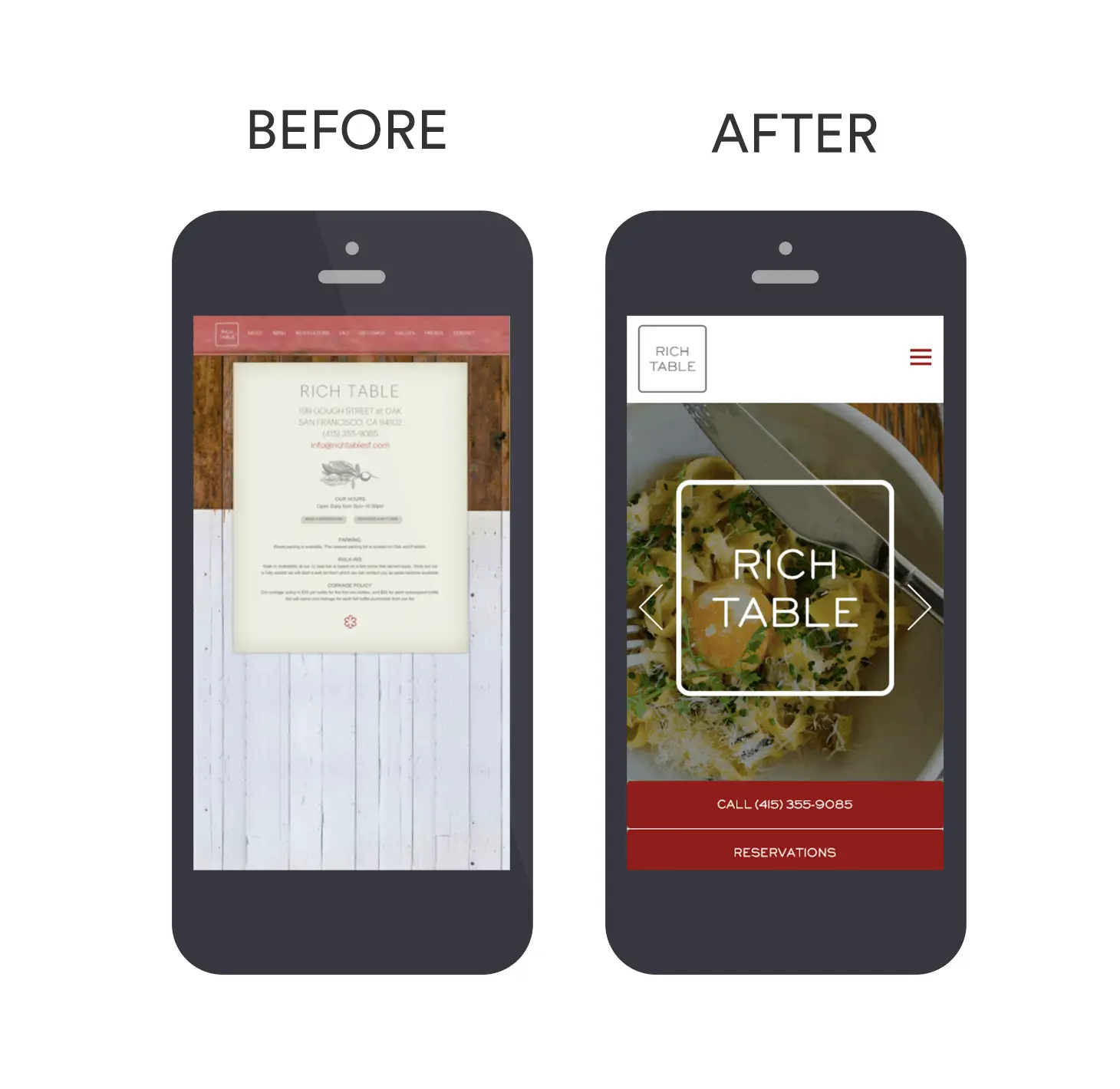
Before: The old website for this Michelin-starred San Francisco restaurant wasn’t mobile-friendly, making their information small and difficult to read. Their menus were on PDF files, causing slow page load times and hurting their SEO. On top of that, making any general updates to the website was difficult and time-consuming.
After: Rich Table now has a fully responsive website, with text-based menus that not only load quickly and improve their SEO efforts, but also are super easy to update on the fly with their new BentoBox backend.
The best part: The team can now promote their cookbook on their restaurant website, with a dedicated Cookbook page that shares recipes and a store where guests can buy the book online.
Hill Country Chicken
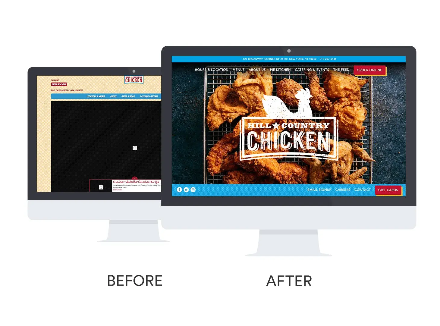
Before: Not much stood out on Hill Country Chicken’s old website due to small text and a subdued, traditional style. Their photos wouldn’t always load, and the operators of this Southern-style eatery found it difficult to make any updates to their website, meaning much of their information was out-of-date.
After: Their new photo-forward layout gives Hill Country Chicken’s website a more modern feel, while staying true to their down-home brand. Their new website is also built to support and quickly load high-res photography, which can be updated in a flash when they want to display new menu items.
The best part: Before, Hill Country Chicken had no way to collect contact info for their email newsletter online. Now they have a signup form accessible on every page, making it easy for guests to sign up and stay informed.
The Pinewood
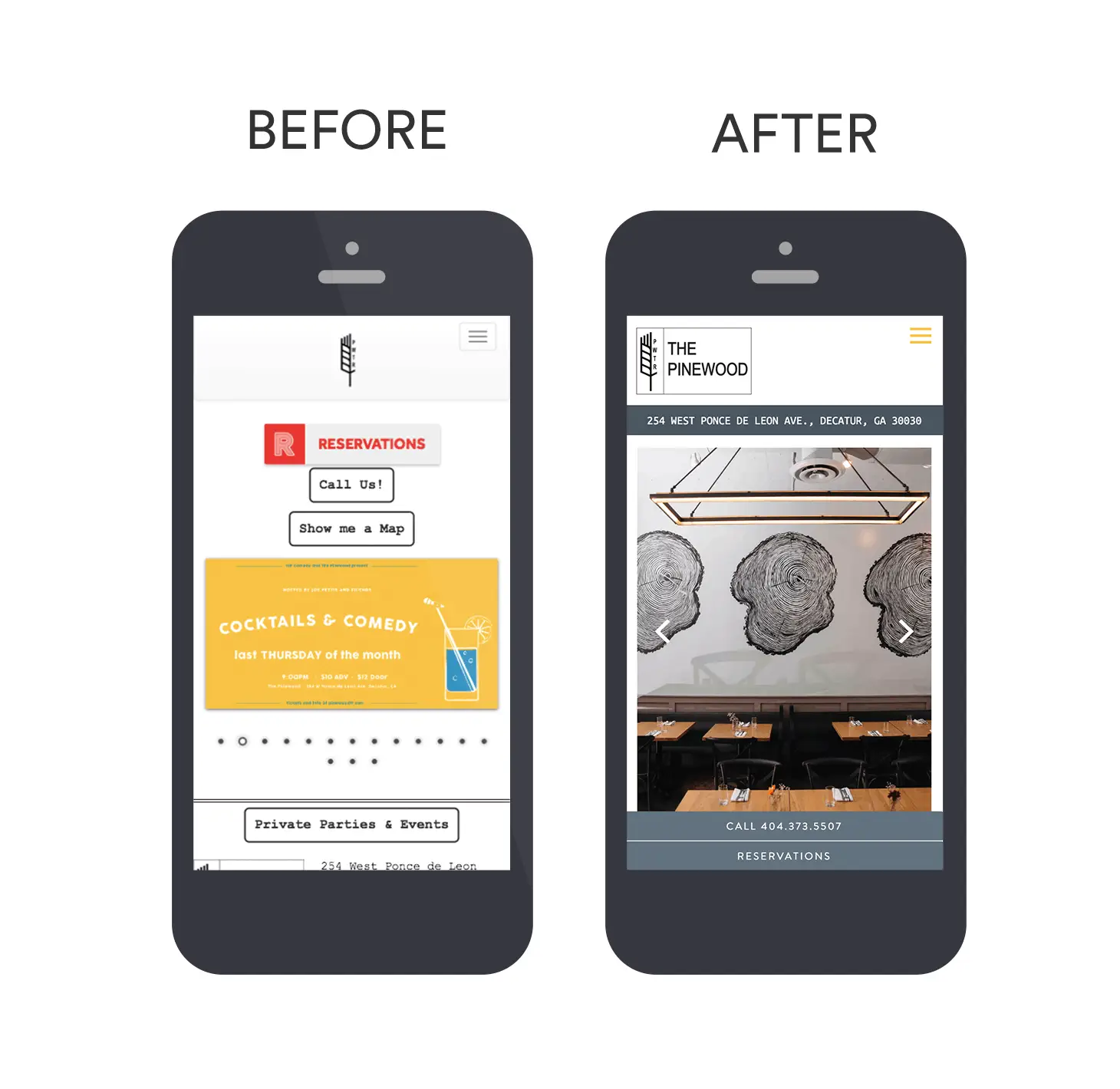
Before: The Pinewood’s old website wasn’t supporting the restaurant’s knack for hosting classes and special dinners. There was no easy way for guests to buy tickets without using a third party, and promotional graphics felt clunky and out of place on the Georgia restaurant’s homepage.
After: The Pinewood team has taken control of their special events, offering ticket sales directly on their website and building a designated Upcoming Events page on their website, all designed in a way that unifies their brand aesthetic online.
The best part: With the addition of a hospitality footer, The Pinewood now connects guests to all of the other concepts within the 10 Apart Hospitality group.
The Restaurant at Patowmack Farm
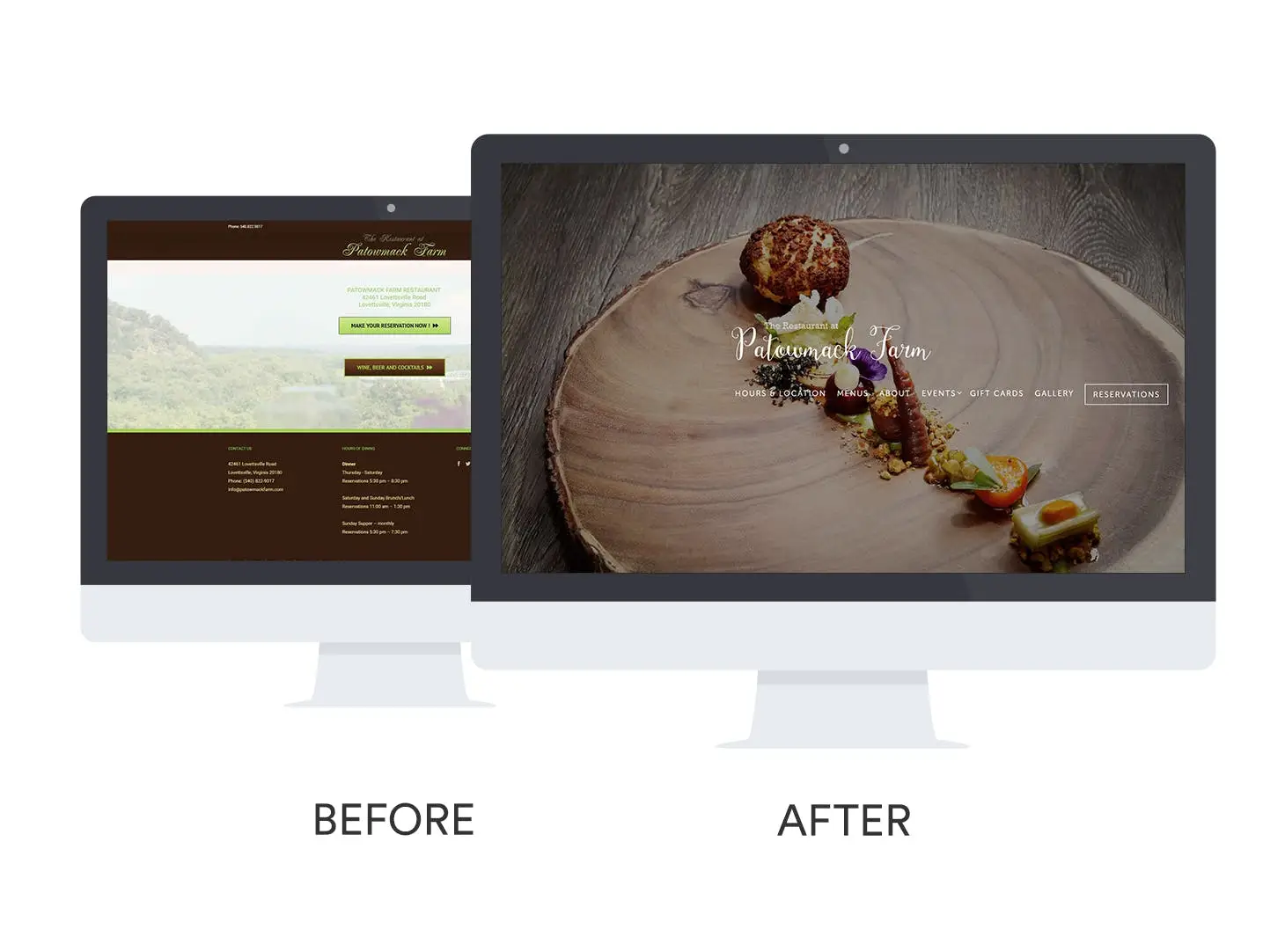
Before: Patowmack Farm’s outdated website design felt too limiting. The farm-focused restaurant had no way of selling gift cards online, and connecting with guests about private events was cumbersome, hindering their ability to take advantage of these extra revenue streams.
After: The restaurant can now easily sell gift cards to all their guests 24/7 from their new website. They have also incorporated a private event inquiry form that allows them to collect key information like time, date and type of event details from guests, offering a smooth and streamlined booking process.
The best part: Patowmack Farms can now show off their glowing reviews with a designated, clearly laid out Press page.
Recommended
Design Inspiration
New Year, New Look: Restaurant Website Design Inspiration for 2018
January 10, 2018
A roundup of our favorite restaurant website redesigns
Websites
No, Your Restaurant Doesn’t Need An App
July 10, 2024
Debunking a common myth about online ordering.

Design Inspiration
The Best Hotel Restaurant Websites of 2024
March 22, 2024
The most beautiful, revenue-driving websites for restaurants, bars, bakeries, and other hospitality businesses located within hotels.

