Websites
10 Essential Elements + Design Tips for Restaurant Websites
How to stand out online and make sure your website stacks up.
These days, restaurants have two storefronts: their physical space and their digital space. Both of these spaces connect to each other: diners look online to discover where to eat by visiting a website first, and website visitors turn into dining room guests and customers.
Standing out among the competition online is the key to success. The best restaurant websites are designed to reflect a restaurant’s brand and provide a stellar user experience that converts visitors into paying customers.
But what makes a website great? There are ten elements that are essential to a powerful restaurant website, plus seven design components to consider.

RESOURCE
A Guide to Restaurant Branding
Find prompts and questions to help you define your brand, and discover how to bring it to life.
10 Essentials of a Restaurant Website
A good restaurant website communicates a specific ambiance, outlines the menu, accepts orders, processes payments, anticipates questions, and makes guests feel valued. In short, it is a restaurant’s digital front of house. Here are ten keys to making your digital front of house as successful as your traditional one.
1. A great restaurant brand story
Every restaurant has a unique story to tell, and its website is the most powerful place to tell it. Given that 77% of diners visit a restaurant’s website before deciding to dine, a compelling website that reflects the brand and experience is integral to success. A prominent logo, evocative photos of the food and interior, and captivating descriptions about the restaurant go a long way in effectively conveying that story.
Read more: Restaurant Branding: From Dish Names to Interior Design
2. Easy to update
Managing changes should be as easy as opening the door for guests. Restaurant operators are busy and should not be held captive by the long wait times and high fees that design agencies quote for changes. Restaurants can take back control with an all-in-one system that makes editing menus, creating events, and managing online orders simple and intuitive. After all, the website is a direct reflection of a restaurant's storefront.
3. Professional photography
Photographs of the restaurant's cuisine and atmosphere convert online visitors into customers. It’s a simple way of visually selling. In fact, 45% of diners specifically look for food photography when visiting a website. Professional photography might seem like a luxury, but it's not an expense — it's an investment.
In our era of user-generated content, there's a certain cool factor associated with photos that look raw and unfiltered. But when it comes to images of food on your website, it's better to make sure you're presenting your product in the best possible way. High-quality photography is the backbone of any effective website design. A true professional can make your food look great AND make it look cool for the 45% of diners who specifically look for food photography when visiting a website.
4. Mobile-friendly design
We live in a mobile-first world. In fact, seventy percent of visitors to restaurant websites come from a mobile device. Search engines know this, which makes a mobile-friendly and responsive website essential for ranking high in search results and providing a best-in-class user experience.
Read more: 8 Easy Steps to Improve Your Restaurant SEO
5. E-commerce capabilities
Gift cards, event tickets, and branded merchandise are easier and cheaper than ever to produce and sell, and they do a great job of driving customer loyalty. Restaurant-specific all-in-one platforms let you quickly spin up these revenue lines and manage them in one place without copious amounts of integrations.
Read more: How to Use Ecommerce to Boost Your Restaurant's Sales
6. Location and contact information
Visitors to a restaurant’s website are looking for crucial information like hours of operation, the restaurant’s address, and contact info. When visitors have to sift through pages to find this information, they are more likely to leave for another website (potentially a competitor’s). Making that information prominent is critical for converting online visitors into paying customers.
7. Text-based menus
In addition to hours and contact information, online visitors are looking for food and drink menus. Restaurants must ensure that their offerings are up-to-date. Text-based menus are simple for restaurant operators to quickly edit. Furthermore, PDF and image-based menus are unreadable to search engines and assistive technology, impacting search results and leaving the restaurant vulnerable to ADA-related issues.
8. Prominent reservation and online ordering buttons
When a visitor lands on a restaurant’s website, it should be simple for them to book a table or order pickup or delivery. The best restaurant websites promote reservations and online ordering in their top navigation and then keep the navigation bar fixed on-screen. On mobile, quick action buttons are always visible and often promote a user to start an order or call the restaurant. These buttons increase conversions, connect guests with restaurants faster and drive more revenue.
Read more: Which Restaurant Reservation System Should You Use?
9. Catering and private event contact forms
Contact forms allow visitors to inquire about catered or private events and help drive additional revenue streams. Having a clear contact section helps guests connect with the restaurant faster and streamlines the communication process, reducing the amount of back and forth. In the fast-paced world of restaurants, time is money and a system that makes managing catering and private event inquiries easier frees up staff to provide great hospitality to other guests.
Read more: 38 Restaurant Event Ideas to Drive Revenue
10. Digital accessibility features
Websites are considered a public realm under the Americans with Disabilities Act (ADA). Therefore, restaurants are held responsible for ensuring that their websites are digitally accessible to anyone online. Restaurants must align with the ADA and WCAG guidelines to minimize the potential for ADA-related lawsuits and to be on par with the latest online accessibility standards.
Read more: What Restaurants Should Know About Digital Accessibility
7 Design Principles to Keep in Mind
Once you have the basics of your restaurant website down, bring your branding to life by following a few basic design principles. BentoBox’s web design team shares seven strategies to experiment with as well as examples from real restaurant websites.
1. Contrast
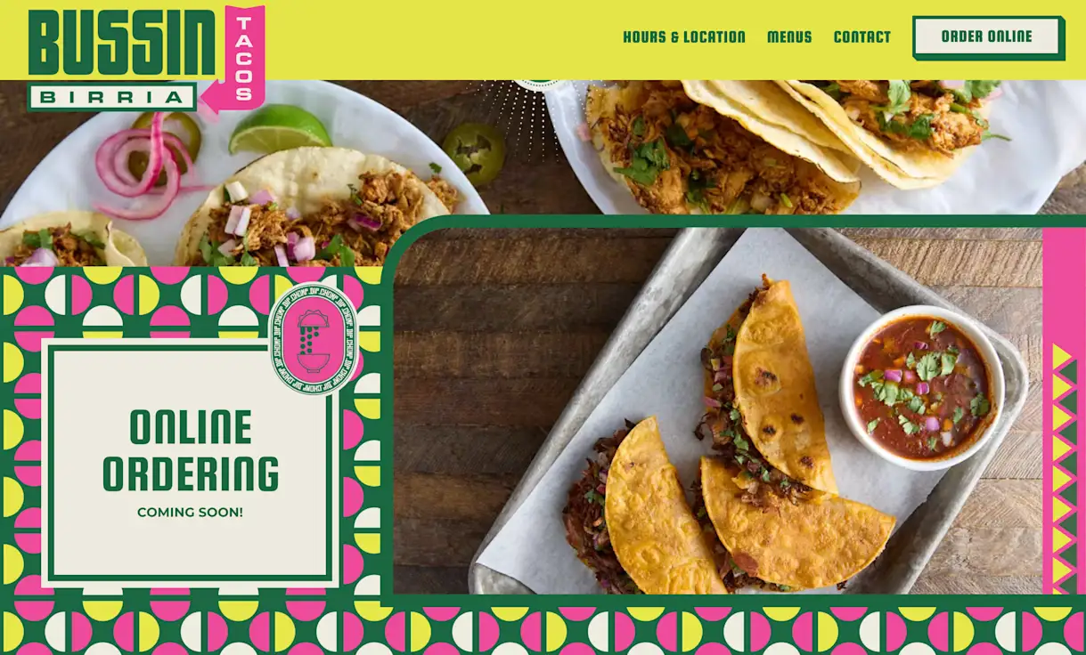
Contrast through differences in color, shape, and more can help guide a user through the site. Bussin’ Birria Tacos is a recently launched website for a taco joint located in the Mall of America. The photos of their birria tacos look amazing against their branding with vibrant colors and patterns, where most of the contrast lies. The neon yellow and bright pink play off the deep green color and show how fun this taco slinging joint is. The website alternates between sections with a full yellow background and crazy patterns, giving the user all the more reason to scroll through.
2. Repetition
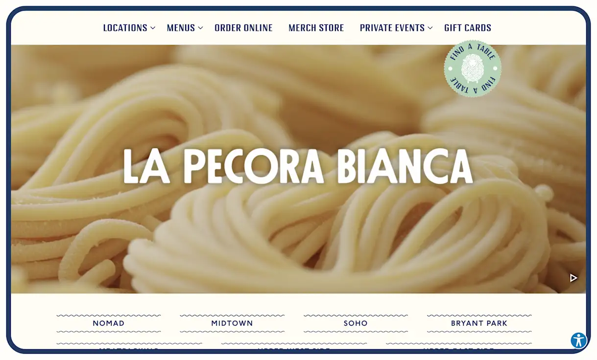
Repeating various design elements can help drive home what a brand is all about. La Pecora Bianca is a charming Italian restaurant whose website shows many simple, repetitive patterns throughout. When the page loads, it immediately shows you what the establishment serves with a fun, tiled pasta pattern that swipes up to reveal the page. Squiggly lines that make you think of pasta shapes repeat throughout the website, whether as a link hover or a footer element.
3. Unity
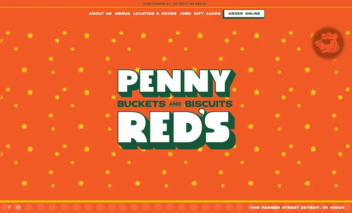
A design is unified when all the elements agree with one another. Penny Red’s website is a great example of a unified design. Penny Red’s promotes their buckets of biscuits and fried chicken with beautiful photography, fun patterns, and bold fonts. The colors and patterns on the fried chicken packaging come alive digitally in lots of places on the page. The single scroll nature of the website makes navigating it feel like one consistent journey where the end of the road leads to buckets of tasty fried chicken.
4. Balance
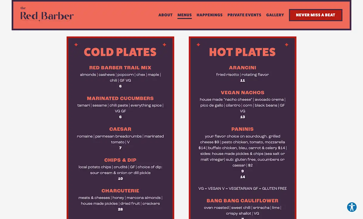
All design elements have visual weight, and a sense of balance can be achieved with symmetry and asymmetry. The Red Barber is a swanky rooftop bar in Denver whose website manages to achieve perfect balance with varying page elements. The homepage alternates between full-width photo carousels and smaller content boxes for their menu and happenings. Their menu page is another great example of visual balance using colors and icons. The deep red and purple colors make each column feel balanced with one another.
5. Hierarchy
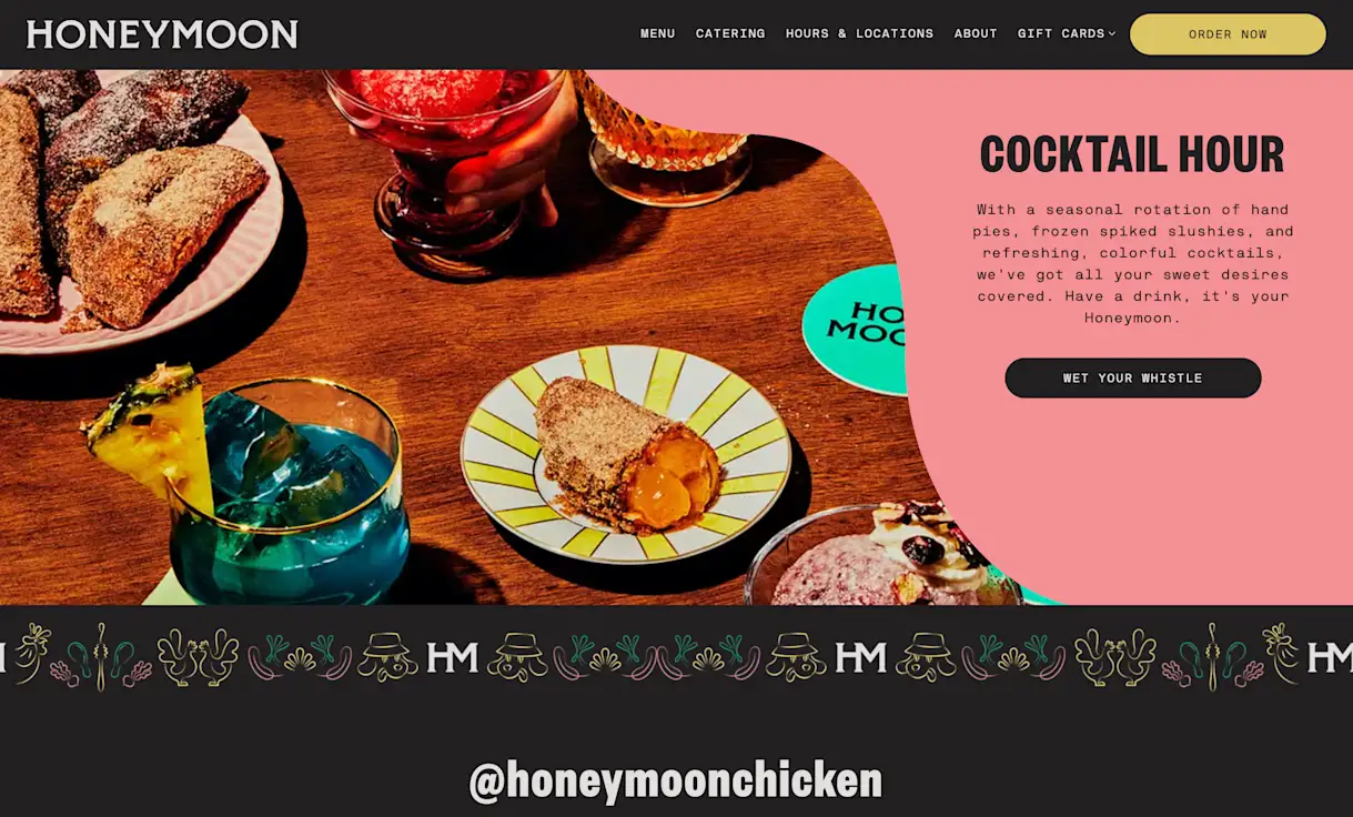
Hierarchy is about ranking different design elements to lead the user’s eye effectively through a design, and it can be leveraged via the other design principles we’ve discussed here. Honeymoon Chicken uses many design elements to help make information easy to access and keep the user scrolling on their page. The top navigation has key links, and a bright, contrasting button gets users to order food easily. The homepage alternates between full and split overlays with color and photography, which helps to clearly provide information about things like reservations and happy hour. ~Groovy~ color blocks in the split overlays help bring the eye down the page as well.
6. Scale
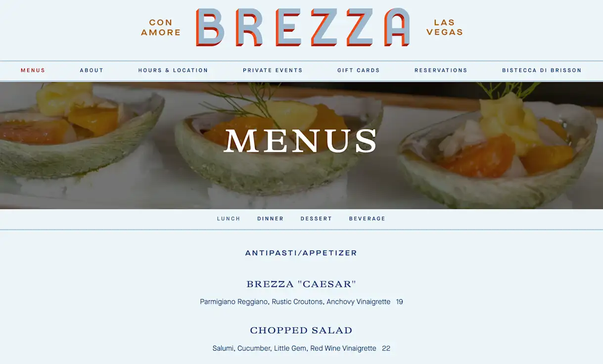
Scale is often used in combination with emphasis. On Brezza, scale is used in a number of ways to create an interesting composition. At the very top of the site there is an oversized logo that shrinks down as soon as the user starts scrolling. Also present at the top of the page is the navigation bar, which spans the entire width of the page. On the opposite end of the spectrum, the hero images on interior pages are dramatically shortened. In the same vein, the typography feels small and delicate when compared to the other larger aspects of the website.
7. Emphasis
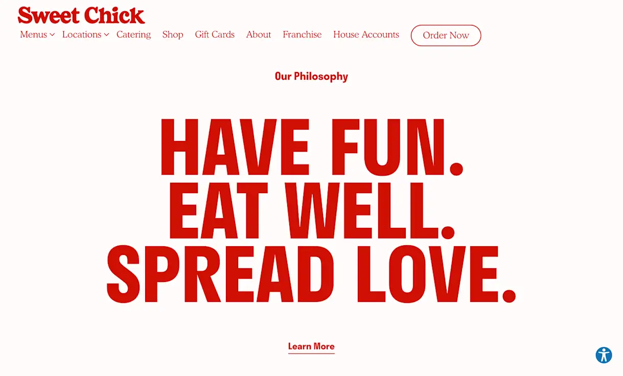
A great way to create emphasis in a design is through tools like size, weight, position, and color. There are few ways this happens on the Sweet Chick website. One of the most dominant techniques is the comparison of the oversized headings in relation to the rest of typography. In this instance, you also feel the sharp contrast of the deep red color on the off white background. Going back to scale, it is also noticeable that all the images on the website, as well as graphic assets like the map marker, are large and in charge.

BentoBox Marketing & Commerce Platform
Want to stand out online? Let's chat.
Drive revenue directly through your website.
Recommended

Marketing
8 Easy Steps to Improve Your Restaurant SEO
March 10, 2023
Learn some best practices that restaurants can use to boost their local search rankings online and get more guests through the doors.
Websites
How to Choose a Restaurant Website Design Company
May 20, 2021
What to look for when searching for a restaurant website design partner.

Websites
10 Most Popular Restaurant Website Builders in 2024
February 21, 2023
An overview of the current restaurant website landscape.
