Year in Review
Restaurant Web Design Trends in 2023
December 4, 2023
The BentoBox Web Design team on what they saw and built this year.
For BentoBox’s 2023 Restaurant Trend Report, our Web Design team analyzed some of the trends they’ve seen, heard about, and participated in this year. Here, culled from hundreds of hours talking to thousands of restaurants, were the restaurant web design trends that defined 2023.
Oversized Elements
By James Coviello, Sr. Web Designer II
The bigger, the better!
While not true in all cases, designers probably agree that lately we have seen the emergence of oversized elements that span fully across web pages. So why has this trend become so popular? Because extremely sized typefaces, logos, or illustrations serve as bold attention grabbers. Their theatrical feel attracts visitors to websites and invites them to engage. It is an easy and effective way to set your site apart from others who may struggle with informational hierarchy. When you apply oversized elements on your site, there is no doubt where your eyes should land first.
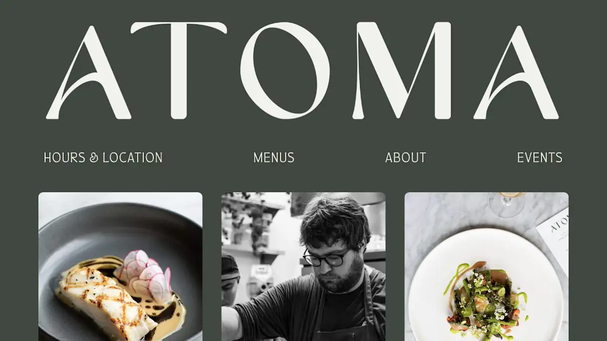
Seattle’s Atoma opened this year. The name was inspired by the Greek word for invisible, but when you land on their site you know that this concept is begging to be seen. Their logo uses a very expressive typeface that is displayed in huge characters from end to end. It immediately focuses your vision and allows you time to digest the content underneath.
While you may expect oversized elements to bring a level of casualty to a site, Atoma is proof that you can go big and preserve your elevated brand.
Tonal Textures
By Chelsea Davis, Jr. Web Designer
Tonal colors, often referred to as monochromatic colors, are colors that are varying shades and tones of the same base color. Implementing tonal colors is a great way to achieve color balance and harmony in a design.
While tonal palettes have long been used in design, this year has brought an increase in tonal texture applications on website designs.
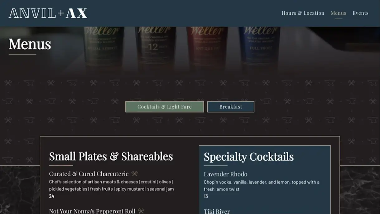
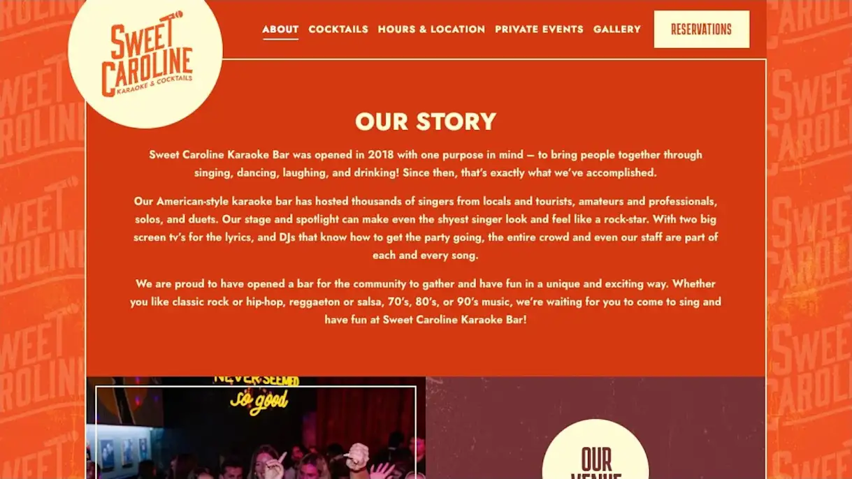
Layering tonal textures allows additional dimension and/or branding without drawing attention away from the site content. With the revival of retro design styles in the last few years, it’s only natural that tonal textures would make a resurgence. Tonal textures utilize a limited color palette and often feature an added grain reminiscent of early print design.
Anvil + Ax (above) uses tonal layering to include two textures behind the menu content.
Sweet Caroline (below) uses a tonal texture as the background on this fix-width site.

PRODUCT
Websites for Restaurants
Get a beautifully designed website with tools to grow your business.
Early 2000s Style
By Chris Nervegna, Sr. Web Designer
The phrase “what goes around comes around” applies in all aspects of life, whether in fashion, music, interior design, architecture, etc. But more recently, we’ve been seeing a resurgence of early 2000’s web design styles coming back around.
If you’re a designer/developer, your earliest coding experience is probably updating your Myspace profile with scrolling marquee text, embedding images, changing your cursor, or even adding animated GIFs. You may have thought that all of that went away when Myspace slowly faded away years ago, but you would be certainly wrong.
You might be asking yourself why these early 2000’s design style trends are coming back all of a sudden? I mean, today’s technology is far better than ever and we’re able to achieve so much more with code now than we could ever imagine.
You could probably argue that nostalgia plays a big part, which I would definitely agree with. Especially with social media trends of people sharing their first AIM usernames, or how crazy fashion trends used to be. But I also think that the oversaturation of overly designed sites can get repetitive. Don’t get me wrong, you can scroll for hours through sites like Awwwards.com and be mind blown at what people can accomplish with code nowadays. And while all of them are absolutely beautiful and a great example of today’s technology, they all start to blend together. Because of this, I think designers are starting to strip away sites to the core and start making their sites stand out more by making them “quirky” and pulling that nostalgic emotion out of us.
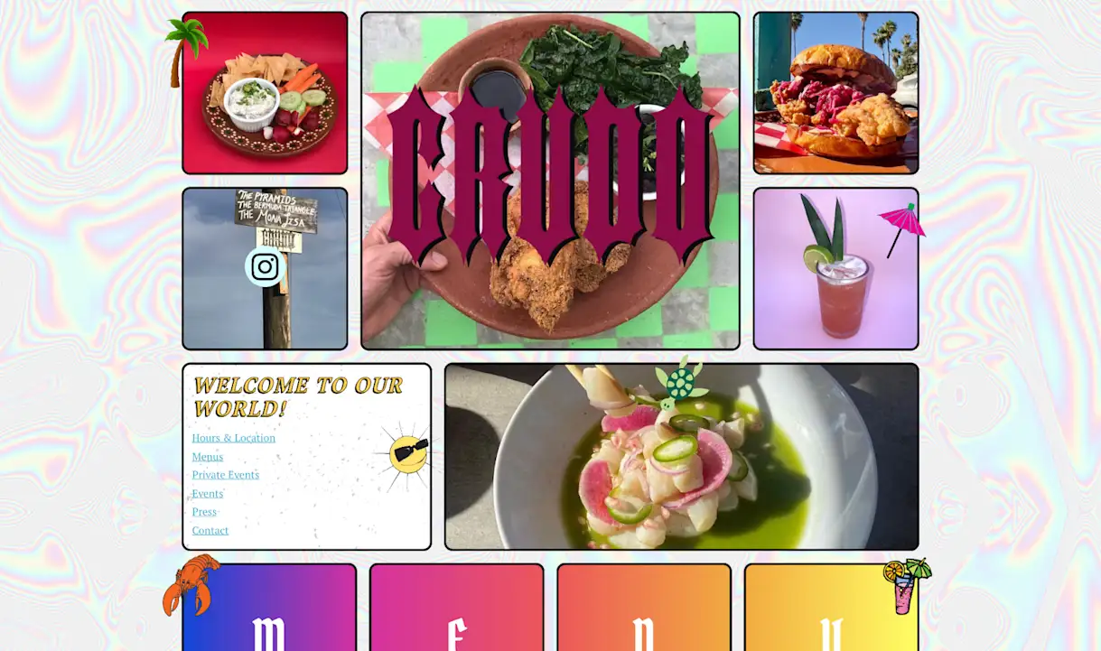
A great example of this that was recently launched by us here at BentoBox is a Mexican bar called Crudo. They requested a site that didn’t fit the “status quo” and was the complete opposite of standard corporate-type websites. They wanted that nostalgic feel, with terrible clip arts and whacky icons and images. Crudo’s site immediately brings you back to the early 2000’s, updating your top 8 friends on Myspace and instant messaging your friends after school. You land on their homepage and forget what year it is.
It’s hard to predict what trend is coming next, but I certainly don’t mind having this one stick around a little while longer.
Grid lines
By Bella Ambrosio, Web Designer
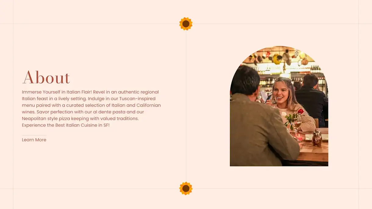
Visible grid lines are one of the newer trends in the design world. Designers are leaning into the natural shapes they build on the page and making their grid lines stand out to achieve a bold, geometric appearance. They are not only great to add some pizazz to the site but also to create a visual content structure and guide the viewer from one section to another.
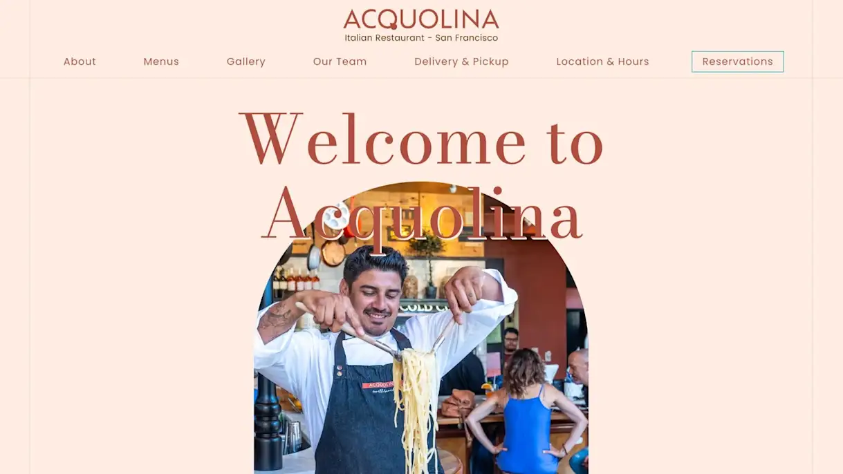
The use of grid lines is a great solution for clients who don’t have strong branding but want to make their site more interesting. We just need to be careful to not get too excited with it so the site doesn’t end up looking too heavy.
A great example of grid lines applications is Acquolina. The lines are very thin, keeping the light and elegant feel of the brand.
Load-in animations
By Kayla Scheidel, Sr. Manager, Web Design
In the ever-evolving realm of web design, load-in animations have emerged as a captivating trend. A load-in animation is a dynamic visual effect that occurs when a webpage is first accessed by a user, serving as a visually engaging transition while the content loads. These animations can range from subtle fades and transitions to more elaborate movements and transformations, all designed to captivate the user’s attention and enhance the overall user experience.
The popularity of load-in animations in web design this year can be attributed to several factors. Firstly, they provide an immediate visual feedback that the webpage is actively loading, which can mitigate the perception of slow loading times and keep users engaged during what might otherwise be a dull wait. Additionally, load-in animations are a powerful storytelling tool, allowing designers to convey a sense of brand identity, creativity, and innovation.
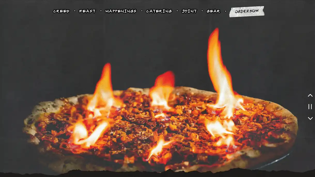
Evel Pie is a great example of this trend — where the load-in animation not only excites the user, but introduces a logo. The movement feels on brand for this customer’s logo and “rough around the edges” brand aesthetic.
Recommended
Year in Review
Restaurant Social Media Trends in 2023
November 28, 2023
Colby Kingston, Social Media Manager at BentoBox, reflects on the trends she saw in restaurant social media in 2023.
Year in Review
5 Top Restaurant Trends for 2024
December 18, 2023
Our team weighs in on the tech and cultural trends on the horizon for hospitality.
