Design Inspiration
7 Tips for Better Restaurant Menu Design
October 20, 2023
Find detailed pointers on visual menu design along with examples of real menus that illustrate each suggestion.
Imagine a new guest sitting down at your restaurant, excited to try it out after hearing rave reviews from friends. Then they take one look at the menu and are immediately put off by a poor layout, sloppy organization, or illegible typeface. This kind of experience can leave a bad taste in a guest’s mouth before they’ve even had their first bite.
A menu is one of the first branded materials diners interact with, so make it count. Putting effort into the visual design of your menu — and making intentional choices — can pique a guest’s interest, solidify your restaurant identity, and drive sales.
At BentoBox, we know a thing or two about menu design. We’ve developed this handy guide to give you a head start on designing a menu from scratch. Follow these tips to create a menu that lets your restaurant shine.
Tip #1: Use white space.
White space, also called negative space, refers to the empty areas between lines of text or around elements on a page. When used properly, white space guides a reader through your menu and draws attention to what you want them to pay attention to. It improves readability, creates balance, and conveys elegance. Too little white space can leave your menu looking jumbled and chaotic.
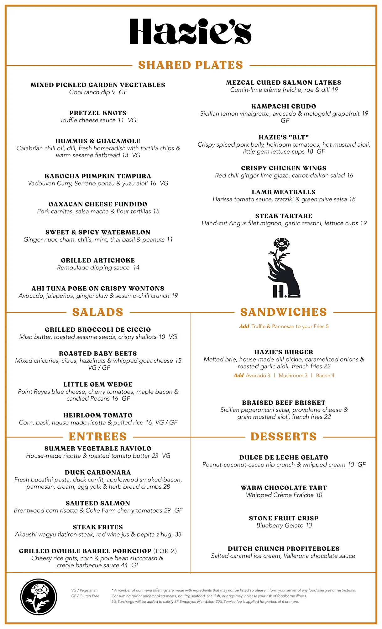
Example: Hazie’s
In the menu at Hazie’s in San Francisco, the owners draw attention to their dish names and simple ingredients by keeping breathing room between descriptions. There are five distinct categories, yet the menu doesn’t feel too cluttered or overwhelming thanks to the use of white space throughout.
Tip #2: Use food photos sparingly.
Diners eat with their eyes first, so if you wish to use food photos on your menu, make sure you choose great ones. Not every dish needs its own glamor shot; consider featuring photos of only a few standout dishes, and working with a professional photographer to make them great. If you’re in doubt about whether photos are right for your menu, it’s best to avoid them entirely.
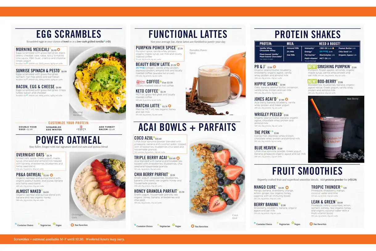
Example: Protein Bar & Kitchen
At Protein Bar & Kitchen, a fast-casual health food concept in Chicago, photos are used carefully throughout the menu. The photos complement but never overpower the actual written descriptions of the dishes. Along with the vibrant photos, this menu also uses dense, bold typefaces and bright colors to convey high energy.
Tip #3: Consider the physical size of the menu.
This is especially important if you aren’t using QR codes at the table for mobile menus. Menu size can be an afterthought, but owners and operators should consider a restaurant’s setting. If your menu is a large book, and your restaurant is very small and intimate, those menus can be awkward to open at the table without knocking over drinks or whacking other diners. But make it too small, and it may not be accessible to everyone.
Example: Milo
At Milo, a Southern-style restaurant in Waco, Texas, the menu fits perfectly on the table. Guests can comfortably peruse the menu without moving any plates, utensils, drinks, or elbows out of the way. Yet the bolded section headers and dish names are easily legible without having to hold the menu up to one’s face.
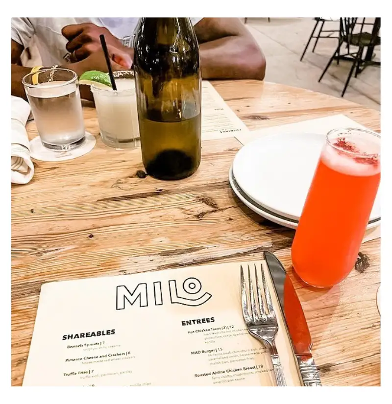
Source: Milo Instagram
Tip #4: Decide how to organize your dishes.
How is your menu organized? Do you follow the traditional order of appetizers, salads, mains, desserts, and sides? Or do you take a different approach? People typically won’t spend too long reviewing a menu, so sections and headers are important for increasing scannability.
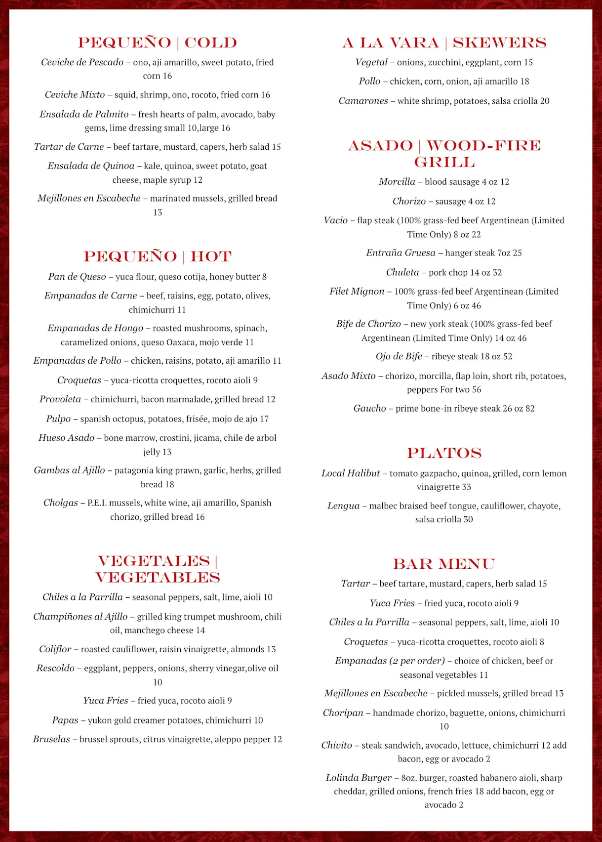
Example: Lolinda
At Lolinda, an Argentinean steakhouse in San Francisco, the owners separate the dishes into categories like cold, hot, vegetables, and wood-fire grill. Since skewers are one of the restaurant’s specialties, it is given a prominent place at the top of the menu. They also emphasize their concept’s Latino roots with headlines in both Spanish and English.
Tip #5: Use your brand’s color palette.
Designing a menu is a great occasion to put your restaurant brand’s color palette to work. Not only can you use your brand colors to further solidify your restaurant’s identity, you can use color psychology to draw attention or get guests excited for certain items: for example, use yellow to communicate playfulness, red to convey passion, and black to express refinement.
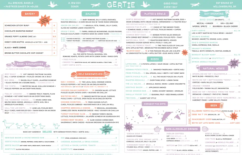
Example: Gertie
At Gertie, a diner in Brooklyn, the owners use light pastels to express cheerfulness, and their strategic use of burnt orange ensures guests don’t overlook their pastry and deli specials. The color scheme and clever use of iconography all communicate that this isn’t your traditional bagel shop.
Tip #6: Pay attention to eye-scanning sweet spots.
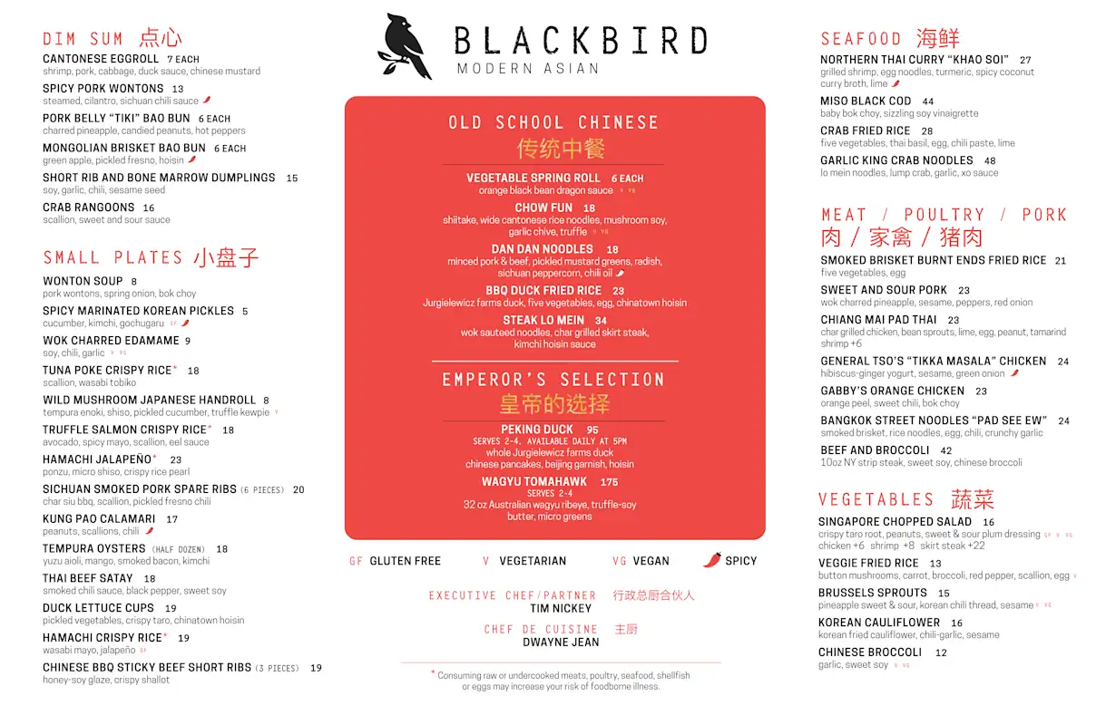
People tend to scan things like menus and websites in a pattern often referred to as the “golden triangle” by designers: they start at the top left, move to the top right, and finish up at the bottom center. Capitalize on those habits by placing your best dishes (or your most profitable ones) in those areas.
Example: Blackbird
At Blackbird, a restaurant in Jupiter, Florida, the centered red box does a lot of work by pulling the gaze to the high-priced Emperor’s Selection at the bottom of the call-out box. On the immediate left and right of the menu, the owners are sure to highlight the high-end seafood specialties as well as their signature dim sum.
Tip #7: Direct attention to your signature dishes.
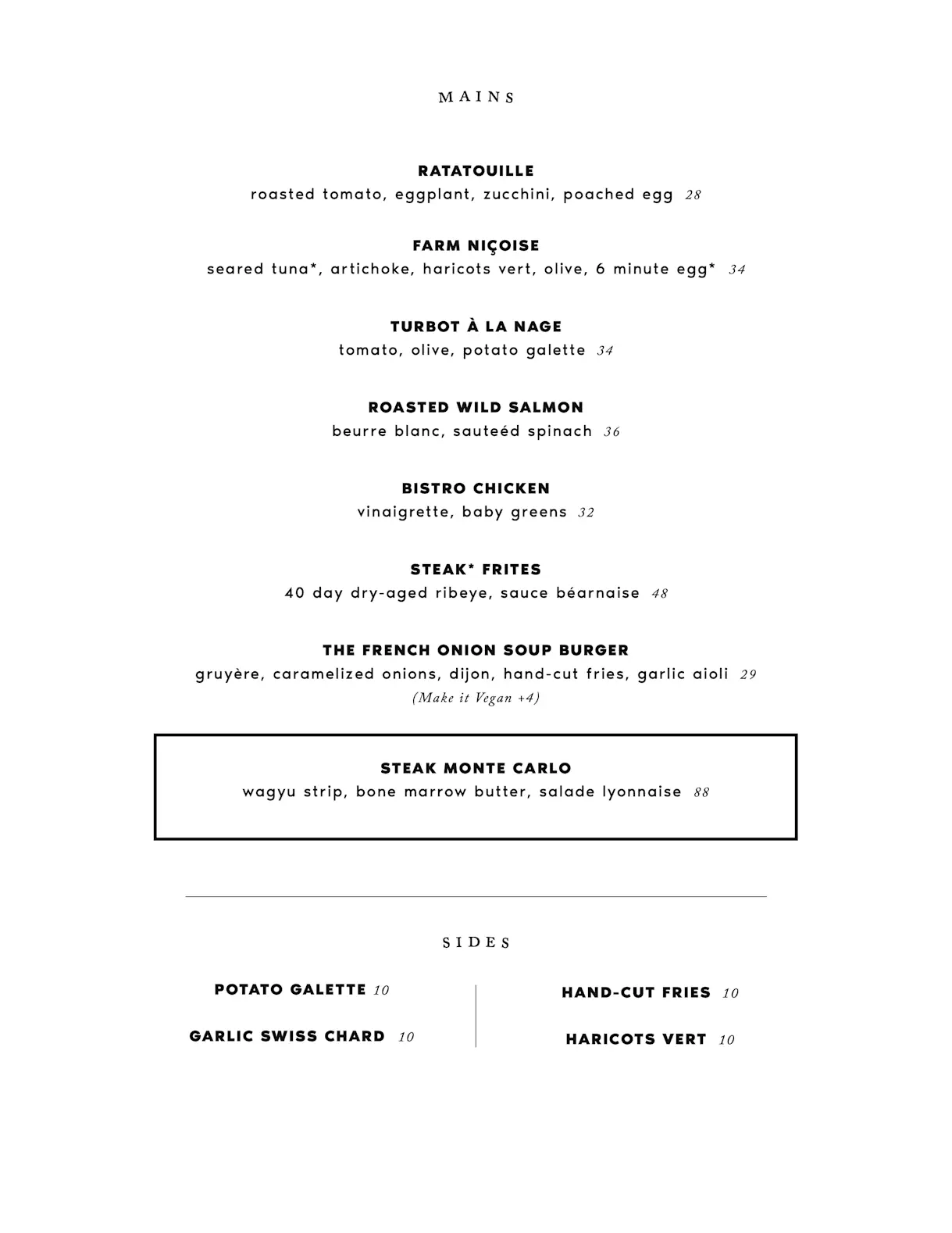
If one of your dishes is a standout, make sure guests notice it. Restaurants can use shaded boxes, icons or borders to grab people’s gaze as they scan the menu.
Example: Little Prince
New York City’s Little Prince keeps its menu short and sweet, listing only the dish names and the main ingredients without much ado. But you’ll notice the menu makes efficient use of a simple call-out box to draw one’s eye to the Steak Monte Carlo, its priciest dish. It’s nearly at the bottom of the menu, but that doesn’t stop a diner from noticing it immediately.

BentoBox Marketing & Commerce Platform
Deliver Smarter Hospitality
Want to stand out online, bring in more money, engage your diners, and streamline operations?
Recommended
Operations
How to Streamline Your Restaurant Menu (and Make It More Profitable)
September 14, 2021
With margins tighter than ever, restaurants nationwide are shrinking their menus. Here's what you need to know.
Marketing
5 Menu Description Tips To Drive More Sales
April 12, 2024
There’s a science behind effective menu writing. Here’s what you need to know.
BentoBox News
Introducing Dine-In Order & Pay: Paperless Menus and Payment for Restaurants
August 5, 2020
How Dine-In Order & Pay by BentoBox changes the game for restaurants.


