Design Inspiration
Our Favorite Restaurant Website Redesigns
February 22, 2017
Before & After: A visual roundup of the best restaurant website redesigns
There are a ton of reasons to redesign your restaurant website. Three of the biggest are to make sure all your content is up-to-date, the site is search engine optimized, and mobile friendly. Even if your site has these three foundations on lock, ask yourself if it gives an accurate, beautiful visual of your restaurant to potential guests, if it anticipates website visitors’ needs by making menus and contact info easy to find, and if it’s driving your restaurant revenue.
Not sure where to start? We’ve picked out some of our favorite restaurant website transformations from BentoBox customers for you to use as inspiration.
So take a look, get those creative juices flowing, and then get in touch to start transforming your restaurant’s website today.
Beco
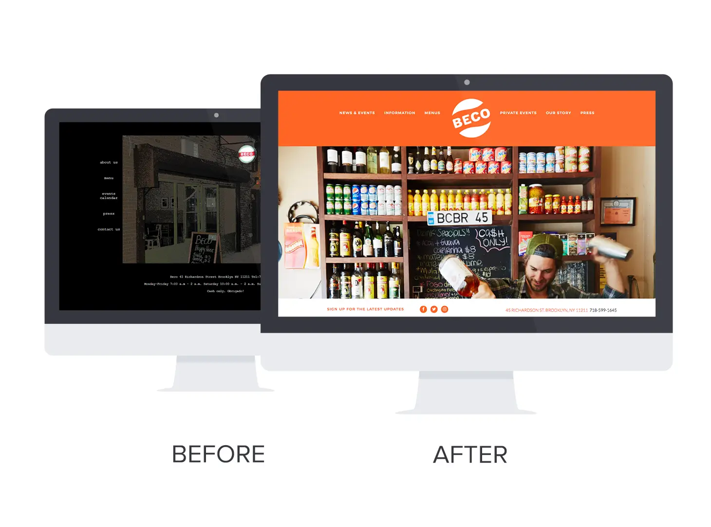
Before:Beco’s site was hard to read and didn’t reflect the bar’s lively spirit. On top of that, their website wasn’t mobile friendly, meaning that guests couldn’t easily navigate from their phones or tablets; and it scored low on Google’s rankings.
After: Beco completely transformed their website with bright colors and beautiful images of their interior. Visiting the new website gives conveys how fun and vibrant the bar is in real life.
The best part? They’ve added alerts to easily update their guests about exciting news and events, coupled with a faster load time, making for a website that can easily be read and scrolled through on mobile devices.
Samurai Mama
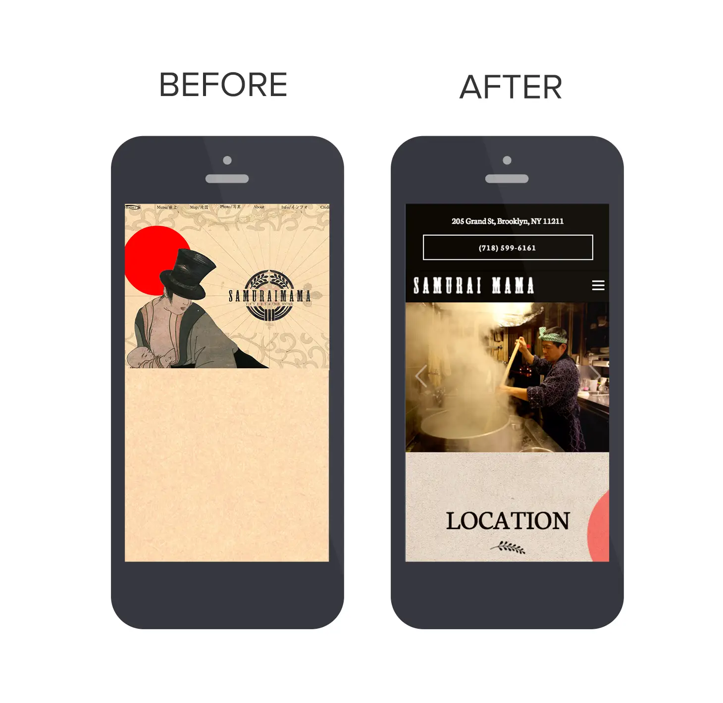
Before: Samurai Mama had issues updating their website, resulting in an outdated homepage that left guests confused. The homepage had an interesting background but didn’t convey the restaurant’s gorgeous atmosphere, leaving guests not only frustrated with the navigation but unsure of all that Samurai Mama had to offer.
After: Samurai Mama’s website took on a sleek, elegant vibe, echoing the restaurant’s stunning interior and artful food. They also gained total control of their website through the BentoBox backend—making it super simple for them to keep their menu up-to-date.
The best part? Guests are no longer left confused about Samurai Mama’s offerings—instead, they’re enticed by the beautiful images and simple design.
La Cucina
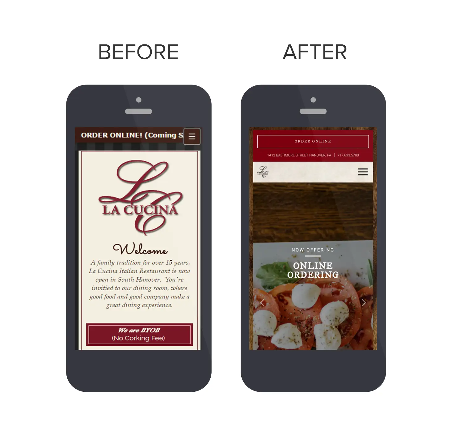
Before: La Cucina's website looked tired and dated, with very little imagery to get a sense of the restaurant experience. There was also limited information about where to find them and how to contact them, specifically on mobile. The result was a difficult-to-navigate restaurant website that didn’t anticipate the needs of guests.
After: Out with the old and in with the new. Not only does the food on La Cucina's new website look delicious, but the most important information, like address and phone number, are clickable and easy to find.
The best part? They went a step further in anticipating their guest’s needs by integrating online ordering right on their top navigation bar.
Island Creek Oyster Bar
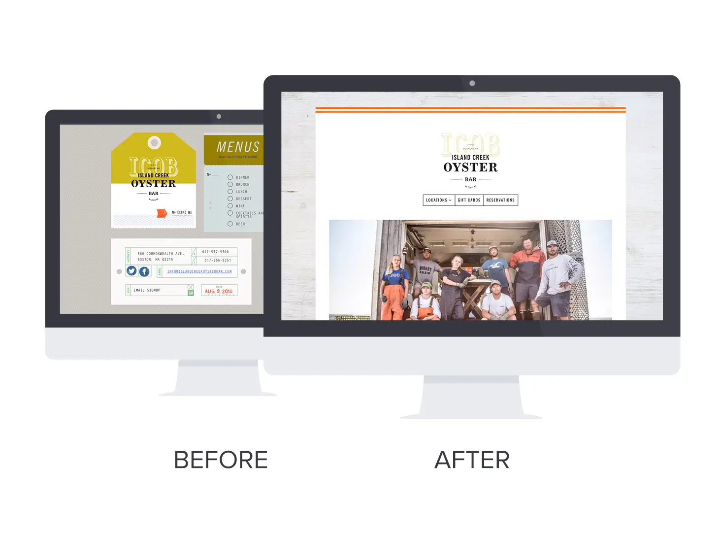
Before:Island Creek Oyster Bar's old website was creative, but the layout was busy, making it confusing for guests to find the information they needed quickly. Their thoughtful messaging about fresh seafood and sustainable farming was lost in the crowded display.
After: With BentoBox, Island Creek Oyster Bar took their cute-yet-confusing website and streamlined it into something beautiful. Now, their message is clear and all of the important info is easy to find.
The best part? They integrated an online career form so that potential employees can apply straight on the website, making the recruiting process easier for both the applicant and the restaurant.
Want a beautiful restaurant website that gives you total control? Get more info right here.
Recommended
Design Inspiration
Best Websites of 2016: Fast Casual, Bakeries & Food Trucks
January 20, 2017
A roundup of our favorite restaurant website designs
Websites
No, Your Restaurant Doesn’t Need An App
July 10, 2024
Debunking a common myth about online ordering.
